 xxxsjan Docs
实现0.5px边框
利用scale只放大content width的特点,从而实现border的缩小two
html
<div class="box two"></div>
<style>
  .box{
    width:200px;
    height:200px;

  }
  .box.two::after{
    position:absolude;
    left:0;
    top:0;
    border:1px solid #333;

  }
  @media (-webkit-min-device-pixel-radio:2){
    .box.two::after{
      width:200%;
      height:200%;
      tranform:scale(0.5)
    }
  }
</style>
toast居中
javascript
position:fixed;
width:fit-content;
inset-inline:1rem;
margin-inline:auto;

等价于
position:fixed;
width:fit-content;
left:1rem;
right:1rem;
margin-left:auto;
margin-right:auto;
width:fit-content能在不改变元素display属性Q的的同时使其具有行内框的某些特性,如包裹内容以自适应内容宽度。如果是max-content就是在一行中尽量多的显示内容。min-content是最小内容宽度,如果是中文就是一个中文字符的宽度。
inset-inline 、margin-inline是逻辑css
max-length过渡问题
两个方案
滚动背景切换
typescript
parent:
scroll=snap-type: y mandatory;

child:
scroll-snap-align:start
css立体效果 透视效果
开启3d
使用了fransform(即 rotate scale这些)的元素上加
**活动的元素加:**transform-style:preserve-3d
注意:
假如子元素使用绝对定位
由于子元素已经使用了transform-style开启了3d
所以绝对定位的相对的就是父级
不需要再设置position:reactive
立体感
这时只是缩放的效果
需要立体感,需要开启透视(近大远小)
**父级元素设置:**perspective:1000px
其他知识
翻转不可见
假如翻转后需要不可见,可使用
backface-visibility: hidden
浮动环绕效果
默认是盒子边界,就算设置了border-radias也是一盒子为准
这时需要用到shape-outside:circle(50%)
真实边框效果 阴影
使用clip-path做抠图后,边框还是盒子边界
可以使用
filter:drop-shadow(0 0 10px #fff)
文字边缘环绕
盒子开启圆角,文字不环绕,还是根据盒子边界环绕,这时需要设置
shape-outside:circle(50%)
图片缩放
plain
object-fit:cover;
object-position:left top;
等比例
css
.container{
width:90%;
height:300opx;
margin:0 auto;
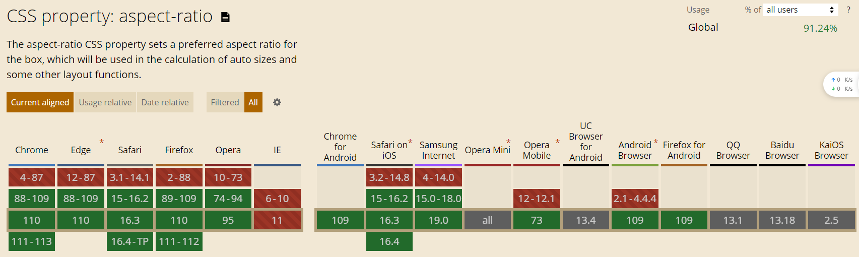
aspect-ratio:16/9;
}
行盒截断样式
box-decoration-break:clone // slice
背光效果
根据图片颜色进行背光显示
.backlight:after {
  content: '';
  position: absolute;
  top: 0;
  left: 0;
  width: 100%;
  height: 100%;
  background:inherit;
  filter: blur(10px);
  z-index: -1;
}
扫描效果
js
<template>
  <div>
    <QrcodeStream
      :torch="torchActive"
      :style="scannerStyle"
      @detect="onDetect"
      @camera-on="handleInit"
      @error="handleError"
      v-memo="[torchActive]"
    >
      <template v-if="showCloseButton">
        <div class="qr-scanner-container">
          <div class="close-view" @click="closeScanner">x</div>
          <div class="scan-line"></div>
          <div
            @click="toggleFlash"
            class="absolute top-2/3 left-1/2 -translate-x-1/2"
            v-if="torchNotSupported"
          >
            <svg
              xmlns="http://www.w3.org/2000/svg"
              xmlns:xlink="http://www.w3.org/1999/xlink"
              version="1.1"
              width="48"
              height="48"
              viewBox="0 0 24 24"
              fill="currentColor"
            >
              <path v-if="torchActive" d="M7,2V13H10V22L17,10H13L17,2H7Z" />
              <path
                v-else
                d="M17,10H13L17,2H7V4.18L15.46,12.64M3.27,3L2,4.27L7,9.27V13H10V22L13.58,15.86L17.73,20L19,18.73L3.27,3Z"
              />
            </svg>
          </div>
          <!-- <div class="qr-scanner">
            <div class="box">
              <div class="line"></div>
              <div class="angle"></div>
            </div>
          </div> -->
        </div>
      </template>
    </QrcodeStream>
  </div>
</template>

<script setup>
import { QrcodeStream } from 'vue-qrcode-reader';
// https://gruhn.github.io/vue-qrcode-reader/demos/FullDemo.html
const emit = defineEmits(['decode', 'close']);

const scannerStyle = {
  position: 'fixed',
  top: 0,
  left: 0,
  width: '100vw',
  height: '100vh',
  zIndex: 9999,
  backgroundColor: 'rgba(0, 0, 0)',
};

const showCloseButton = ref(false);
function onDetect(detectedCodes) {
  console.log(detectedCodes);
  //  JSON.stringify(detectedCodes.map((code) => code.rawValue));
  emit('decode', detectedCodes[0]?.rawValue);
}

const closeScanner = () => {
  emit('close');
};

const handleInit = async (capabilities) => {
  console.log('capabilities: ', capabilities);
  torchNotSupported.value = capabilities.torch;
  try {
    // const { capabilities } = await capabilities;
    // console.log('Camera capabilities:', capabilities);
    showCloseButton.value = true;
  } catch (error) {
    handleError(error);
  }
};
const torchActive = ref(false);
const torchNotSupported = ref(false);
const toggleFlash = async () => {
  torchActive.value = !torchActive.value;
};
const handleError = (error) => {
  const errorMessages = {
    NotAllowedError: '您需要授予相机访问权限',
    NotFoundError: '这个设备上没有摄像头',
    NotSupportedError: '所需的安全上下文(HTTPS、本地主机)',
    NotReadableError: '相机被占用',
    OverconstrainedError: '安装摄像头不合适',
    StreamApiNotSupportedError: '此浏览器不支持流API',
    InsecureContextError:
      '仅允许在安全上下文中访问摄像机。使用HTTPS或本地主机,而不是HTTP。',
  };

  const message = errorMessages[error.name] || 'ERROR: 摄像头错误';
  alert(message);
  console.error(message);
};
</script>

<style scoped lang="scss">
.qr-scanner-container {
  position: relative;
  width: 100%;
  height: 100%;

  .close-view {
    width: 30px;
    height: 30px;
    position: absolute;
    top: 20px;
    right: 20px;
    border-radius: 50%;
    background-color: #fff;
    color: #000;
    text-align: center;
    line-height: 25px;
    font-size: 20px;
    cursor: pointer;
    z-index: 1000000;
  }
}

.qr-scanner {
  background-image: linear-gradient(
      0deg,
      transparent 24%,
      rgba(32, 255, 77, 0.1) 25%,
      rgba(32, 255, 77, 0.1) 26%,
      transparent 27%,
      transparent 74%,
      rgba(32, 255, 77, 0.1) 75%,
      rgba(32, 255, 77, 0.1) 76%,
      transparent 77%,
      transparent
    ),
    linear-gradient(
      90deg,
      transparent 24%,
      rgba(32, 255, 77, 0.1) 25%,
      rgba(32, 255, 77, 0.1) 26%,
      transparent 27%,
      transparent 74%,
      rgba(32, 255, 77, 0.1) 75%,
      rgba(32, 255, 77, 0.1) 76%,
      transparent 77%,
      transparent
    );
  background-size: 3rem 3rem;
  background-position: -1rem -1rem;
  width: 100%;
  /* height: 100%; */
  height: 100vh;
  position: relative;
  background-color: #1110;

  /* background-color: #111; */
}

.qr-scanner .box {
  width: 213px;
  height: 213px;
  position: absolute;
  left: 50%;
  top: 50%;
  transform: translate(-50%, -50%);
  overflow: hidden;
  border: 0.1rem solid rgba(0, 255, 51, 0.2);
  /* background: url('http://resource.beige.world/imgs/gongconghao.png') no-repeat center center; */
}

.qr-scanner .line {
  height: calc(100% - 2px);
  width: 100%;
  background: linear-gradient(180deg, rgba(0, 255, 51, 0) 43%, #00ff33 211%);
  border-bottom: 3px solid #00ff33;
  transform: translateY(-100%);
  animation: radar-beam 2s infinite alternate;
  animation-timing-function: cubic-bezier(0.53, 0, 0.43, 0.99);
  animation-delay: 1.4s;
}
.scan-line {
  height: 50vh;
  width: 100%;
  // background: linear-gradient(180deg, rgba(0, 255, 51, 0) 43%, #00ff33 211%);
  // background: linear-gradient(to bottom, rgba(0, 255, 51, 0) 90%, #0f0 111%);
  background: radial-gradient(
    ellipse (50% 3% at 50% 100%),
    #0f0 -10%,
    rgba(0, 255, 51, 0) 100%
  );
  // border-bottom: 1px solid #00ff33;
  transform: translateY(-100%);
  animation: radar-beam2 2s infinite;
  animation-timing-function: cubic-bezier(0.53, 0, 0.43, 0.99);
  animation-delay: 1.4s;
  position: absolute;
  top: 25vh;
}
@keyframes radar-beam2 {
  0% {
    transform: translateY(-100%);
  }

  100% {
    transform: translateY(0);
  }
}
.qr-scanner .box:after,
.qr-scanner .box:before,
.qr-scanner .angle:after,
.qr-scanner .angle:before {
  content: '';
  display: block;
  position: absolute;
  width: 3vw;
  height: 3vw;

  border: 0.2rem solid transparent;
}

.qr-scanner .box:after,
.qr-scanner .box:before {
  top: 0;
  border-top-color: #00ff33;
}

.qr-scanner .angle:after,
.qr-scanner .angle:before {
  bottom: 0;
  border-bottom-color: #00ff33;
}

.qr-scanner .box:before,
.qr-scanner .angle:before {
  left: 0;
  border-left-color: #00ff33;
}

.qr-scanner .box:after,
.qr-scanner .angle:after {
  right: 0;
  border-right-color: #00ff33;
}

@keyframes radar-beam {
  0% {
    transform: translateY(-100%);
  }

  100% {
    transform: translateY(0);
  }
}
</style>